When participating in the talkshow of Italian photographer Fulvio Bugani, the audience not only admired the 10-year effort put into the series but were also impressed by the intention behinds the construction of images that aim to deliver a social message. I could not help but marvel at images whose frames are divided into different parts or whose subjects are put right at the center – a technique rarely seen practiced by Vietnamese photographers. Fulvio uses shadows to separate the frame into parts among which the contrast or support is tightly connected by lights, colors or the subjects’ expressions.
The discussion section witnessed a lot of questions towards Fulvio, mostly what kinds of lens, how many lens he used, whether or not he set up the scene or why he did not apply the rule of third. It can be seen that these are the number one concerns of local photographers – both beginners and long-time practitioners, despite being aware that the speaker himself is a photojournalist. I wonder, why staying stuck within the principles?
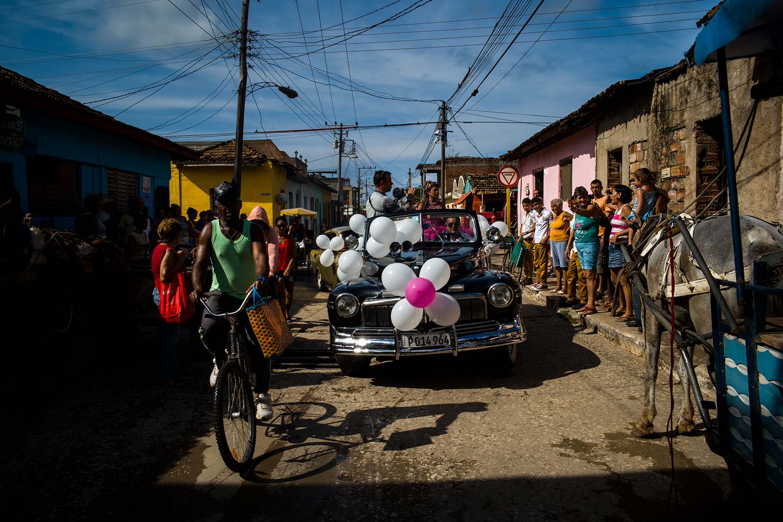
When viewing and taking pictures, a lot put effort into abiding to the rule of third and take it as the guide line for composing their pictures. As a matter of fact, the subjects placed at either “focal points” or “golden points” within the frame are most likely to result in a neat and balanced image. However, juggling with composition rules together with a collective mindset in making art means that demonstrating a personal view or an unique impression is totally out of the question. A mere glance at some local photo contests can unveil the homogeneity ò how participants think and create.
Back to Fulvio’s photos, the two series have captured Cuba include radiant colors, dark shadows and the shifts in facial expressions. My feeling is that the photographer is exceptionally excellent at employing empty spaces within the frames. If many Vietnamese photographers crop the image whenever space is present to create tight composition, Fulvio Bugani uses them to create his own language and deliver his messages.
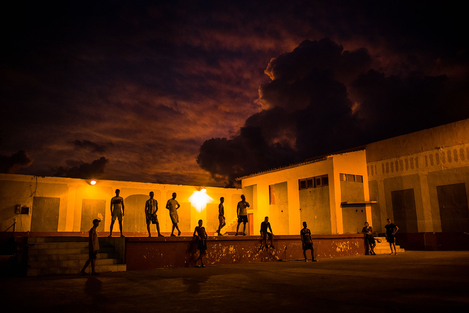
In his first series, spaces from dark shadows ignite tickling curiosity in the audience, making them eager to discover what darkness hides. The bright areas are people in vibrant colors, so does that mean the shadows represent poverty, obsolesce and subsidization that imprison people within those bright colors? The contrast as well as those empty spaces excite viewers’ imagination.
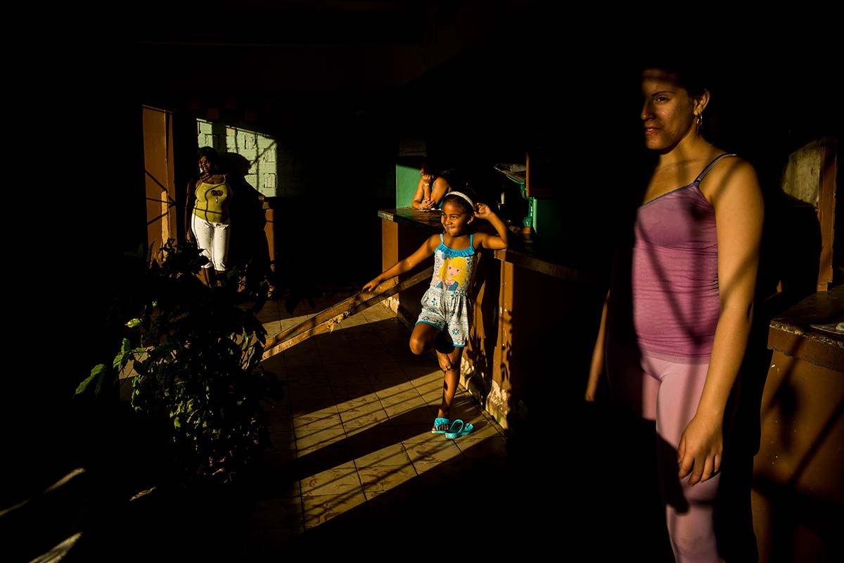
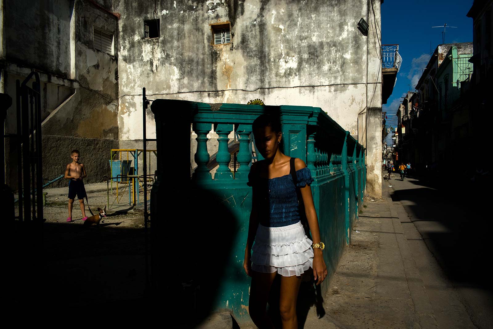
The second series captures a changing Cuba through portraits of people with their living environments. Fulvio utilizes relatively wide framing, resulting in subjects appearing smaller and leaving quite big empty spaces. These spaces are no longer covered by shadows, but this time expose the poverty and obsolesce. The people captured seems somehow lonely in the place that they live in.
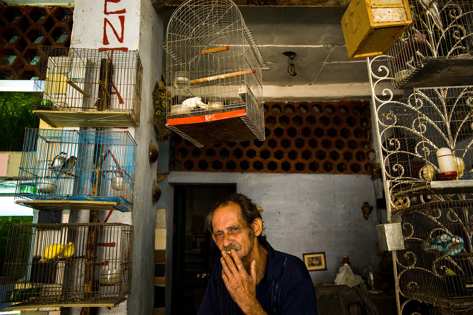
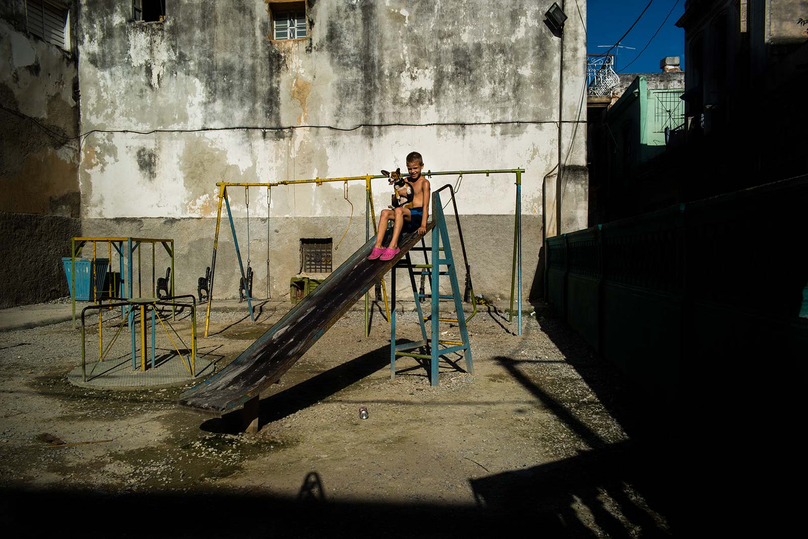
Both ways of using spaces create disparity and similarity, in order to deliver the photographer’s messages.
To sum up, basic photography principles are essential, but the point is to flexibly apply them in the shooting process so as to create impressive and original images. Just as vocabulary is generic, writing an essay largely depends on personal use of such glossary, and the ultimate goal is the message delivered and the feelings generated for audience. There are so many ways to arrange visual elements, “golden points” are only a tiny part. Creativity is an unbound world, while layout principles are only a summary of limited experience. Therefore, composition should only be regarded as a means and not an end.
Dong Hieu was born in Bac Ninh and is working as a lecturer of Art Photography in Hanoi Academy of Theatre and Cinema – where he used to be a student a decade ago. Besides teaching, he often captures daily moments on the street.
Connect with Hieu on Facebook.
