MATCAxC4 JOURNAL: Conversations Around Photography, Vietnam & UK
A series of articles discussing various aspects of image-making. Supported by British Council Vietnam’s Digital Arts Showcasing grant 2021.
????✍️??

We’ve spent a lot of time looking at and thinking about zines this year. With galleries mostly shut, the zine form took on a new significance as a way of creating and sharing work. And although we saw many excellent zines over the past year, this isn’t a ‘best of’ list. Compiled in collaboration with our colleagues at Matca, it’s more of a collective thought piece, a reflection on a small selection of the zines we received, and the wider questions that they prompt – questions about photography and creativity, about the so-called photography and photobook ‘market’ and the various objects that change hands under this rubric.
Most of us who spend a lot of time looking at photobooks like to think that we know a zine when we see one. Typically, it calls up a vision of an A4 or A5 (letter or junior legal for our North American friends) soft-bound publication rather than a 300-page hardback book. Less subject to extensive editing and revision, zines often feel fresher and more spontaneous: a quick glimpse inside the photographer’s mind, a snapshot of the individual creative process rather than the work of many hands. As low-fi and imperfect as the results might be, the experience is often more intimate – as though you’re communicating directly with the person who made it.
The more examples we looked at, however, the less obvious this definition of ‘zine’ became. While there might be a generic format, there are plenty of variants that challenge this – zines as thick as books (Andrew McClees XURC, for instance), books as thin as zines (Grégoire Pujade-Lauraine’s Double Orbit, hardbound and published by MACK, but only 32 pages long, and sewed like a zine inside), beautifully resolved and produced zines (such as the many exceptional projects coming out of the Penumbra foundation’s Riso Residency), or even sculptures like Abel Kleinblatt and Aiko Roegiest’s Indoor Garden Chair – a miniature flat-pack chair that users can assemble themselves. We’ve also started to see gallery brochures – like Black Box Projects’ lush production for Photo London 2021 – that adopt the zine format.
Does a zine have to be self-published? Traditionally, photo zines have been made and shared by artists working outside of the network of commercial galleries and publishers. A zine is a relatively inexpensive way to show people what you’re doing without the need for wall space, without the validation of a gallery or publisher, without the obligation to present the work in a conventionally resolved form – and, in countries such as Vietnam, without the lengthy process of obtaining a publishing permit. Recently, however, some commercial publishers are printing softcover projects stapled or sewn like zines, but as thick as professionally-manufactured books, and with the printing quality to match – Kenta Cobayashi’s Everything 2 comes to mind. Koji Kitagawa’s Photography (Area Books, 2021) is a 750-page compilation of 29 of the photographer’s zines. More and more books are channeling the modest look and feel of a zine while pulling on the design skills and resources of a commercial publisher (Eva Jonas’ Let’s Sketch the Lay of the Land and Fred Mitchell’s If You Go, All the Plants Will Die, for instance). Some major publishers have even been considering the introduction of a zine section into their own catalogue.
We have also learned a lot about the assumption that zine culture is more democratic – cheaper and shared through less formal channels – than the commercial photobook market. In economically developed nations, it’s true that the zine is an affordable alternative to a book. In developing nations, widespread zine production remains uncommon – and when zines are made, getting them seen by Western art consumers isn’t necessarily a priority. But at a time when even those in relatively wealthy countries are struggling financially, £20 for a zine – which the maker may well need to charge just to cover their own costs – is out of reach or unjustifiable for many.
So while we’re no closer to defining a zine, a few things are clear. Zine culture is changing. Increasingly, the photo zine is occupying a position that’s no longer a definitive outside, but a crossover point between the center and the periphery of the commercial photo and photobook market: careers have been launched off the back of a suite of excellent zines (most recently, perhaps, Daisuke Yokota). The punk ethos that defined early zine culture is giving way to something more polished – ultra high production values are now seen by many as an imperative rather than an option. Zine culture is slowly but surely going the way of all outsider art: in becoming part of photography’s ecosystem, it’s charting a path similar to that of the photobook itself – a consumer art object in its own right, rather than the more informal, passing things we could consider many zines of the past.
Bài viết bởi Eugenie Shinkle & Callum Beaney từ C4 Journal
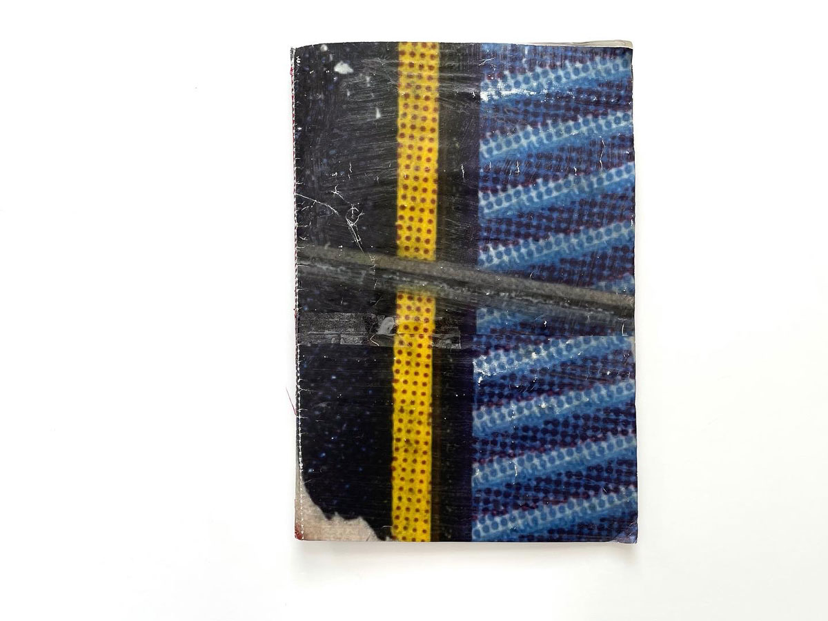
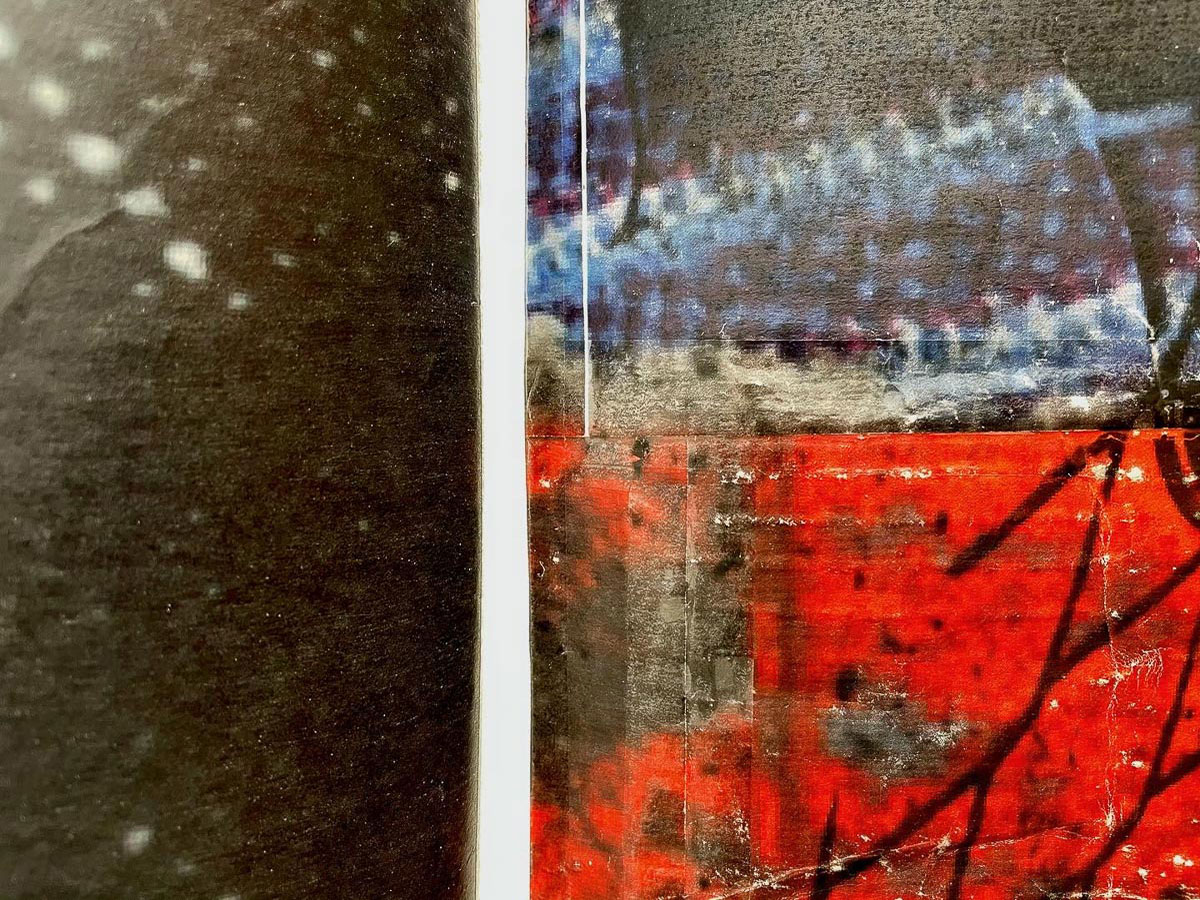
Interfere 1 & 2
- George Kitchen
- Self-published, 2021
A lover of digital artefacts and double-exposure, Interfere 1 was deep, horror-film red; Interfere 2 was a sickly, radioactive green. Where Interfere 1 would show light trails from some kind of drone, the white streaking through the bloody forest floor in blips, in Interfere 2 snow cascades into static, both of which overcover the forest’s angular and jutting branches. You could tally their visual aspects, make a metaphor of them, however their staying power lies in their atmosphere, their quality as a remarkably brief window onto a film-gel inspired take on the grey, ashen landscapes a writer like Cormac McCarthy might construct in their minds before writing. They were probably printed at an inexpensive commercial printer such as Mixam – literally folded A3, with deep colours on a slight texture. There’s nothing overworked or overthought about these two publications – just the satisfaction of an intense visual experience.
- Chosen by Eugenie Shinkle & Callum Beaney


Songs for Women and Birds
- Pauline Hisbacq
- Published by September Books, 2021
Peace signs. Embraces. Linked arms. Hope. Anguish. The struggle to keep American cruise missiles from being stored on British soil was fought, for 19 years, by women who formed a series of peace camps at RAF Greenham Common. By the time the camps were finally dismantled in 2000, Greenham Common had become the largest female-led protest since the suffragettes took to the streets a century earlier. Hisbacq’s collages, roughly cut from archival images, are a reminder of the protests, but they also hint at other battles – for equal rights and opportunities, for respect – that women still face. There’s no hubris in this publication – you get the feeling that Hisbacq chose these images not just for what they symbolise, but for their emotional resonance. The simpler the language, the more powerful the message.
- Chosen by Eugenie Shinkle


What’s New
- Đạt Vũ
- Self-published, 2021
Dat Vu’s knack for finding people and things where they are not supposed to be is evident in his latest endeavor What’s New – a collection of news pictures “surrounding violence and absurdity in contemporary Vietnam”. They are plucked from thousands of images he is exposed to each day in his day job as the photo editor of a major Vietnamese online newspaper. Decontextualized images of vastly different situations are put into a new sequence based on their shared sense of mischief and sometimes visual similarities: in a spread, a gooey silicone implant is placed next to transparent lobster larvae. Eschewing the graphic, this ludicrous, strangely poetic publication hints at violence in the desire to control and consume.
- Chosen by Ha Dao


The Hunter
- Patricia Voulgaris
- Self-published, 2020
This is an old-school production – 24 pages, made on a home inkjet printer with a simple staple binding. We’ve witnessed a bit of a race to the top in zine production values lately, and while we celebrate the artistry and care that goes into such beautifully-made works, it’s also worth recalling that the zine phenomenon is rooted in DIY philosophy. The raw materials of ink and paper are just right for Voulgaris’s work, which attempts to understand the violence that surrounds women. It’s not clear – nor, I think, is it meant to be – whether the female protagonist in these images is the predator or the prey. Weird, alchemical, and darkly humorous.
- Chosen by Eugenie Shinkle


Dieshui
- Upa
- Self-published, 2021
- Produced and edited by Mulu Office
Painter and tattoo artist Upa explores her obsession with waterfalls in the artist’s book Dieshui. Her whimsical, doodle-like inkwork is transferred from skin to paper. The zine consists of double-sided pages with a waterfall photograph the artist took in her travels on one side, and on the other an imagined waterfall landscape she drew from her mind. Without a front nor back cover, the zine could be read at any point like a loop. The photographs and paintings become both internal and external, being in conversation with one another.
- Chosen by Liu Chao-Tze, co-founder of Fotobook DUMMIES Day


Angels & Ghosts
- Joe Westley
- Self-Published, 2021
In ‘Angels & Ghosts’, Joe Westley focuses on obscure forms seen over Zoom communication. The hazy neon obscurity of each image is something of a fragmented reality, which seems foreign yet strangely familiar owing to this pixelated world becoming more apparent in our lives, which are ever-more dependent on digital communication. The webcam has been an ever-growing & vital part of communication over the years; in Angels & Ghosts, these images show the glitters of details of a live music performance experienced online. Joe’s perspective in the project leaves you in wonder whilst being perplexed on how these digital representations of human forms and pixels have become objects of great presence.
- Chosen by Tyrone Williams

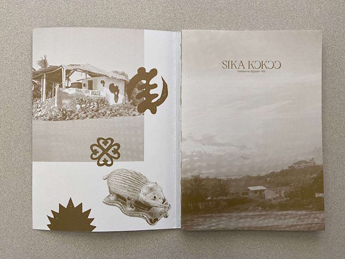
Sika Kokoo
- Kwabena Sekyi Appiah-nti
- Self-published, 2021
Sika Kokoo is a personal investigation by photographer Kwabena Appiah-Nti. Born in the Netherlands to parents emigrating from Ghana, Appiah-Nti’s zine documents his first trip to his family’s homeland and is an attempt to get in touch with his roots and to discover something of his personal identity. The zine juxtaposes two different types of pictures, photographs Appiah-Nti made during his travels and photographs he collected that document traditional gold artifacts of the culture. The intent of the photographer is to pair traditional and contemporary Ghanaian culture in order to get a better understanding as to if or how he fits into it. The title, Sika Kokoo, translates literally from the Ghanaian Twi language as red money, but is best understood as gold, and intended as a reference to an earthly soul. The zine reflects a tremendous amount of joy and curiosity as the photographer fully embraced the opportunity to connect with his heritage.
- Chosen by Brian Arnold


Box 14
- George Booth Cole & Max Critchlow
- Self-published, 2021
Booth-Cole’s roots are in the skate zine community but, like Abel Kleinblatt (also featured here) his work often makes occasional, usually tongue-in-cheek forays into the art world. Box 14 is a collaboration with artist Max Critchlow. In May of 2021, the pair held an exhibition of wheatpasted posters in a community art space on the outskirts of Paris. Following the exhibition, the wheatpasted sheets were scraped off the walls, cut to size, and compiled into a suite of 20 unique zines. Creased and fingerprinted, held together flimsily with tape and thread, Box 14 channels the throwaway aesthetic of early skater zines while also, mischievously inviting us to treat it like an art object. Juan Orrantia’s Of Things Past (created by cutting up and reassembling two 1970s volumes on race relations in southern Africa) also uses non-archival materials, in the expectation that the work will continue to evolve and change. The deliberate ephemerality of works like these is a fresh alternative to the archival imperative that permeates so much of photographic culture. Objects age, they fall apart, they disappear.
- Chosen by Eugenie Shinkle


National Road Number 5
- Lim Sokchanlina
- Published by Catfish Books, 2021
Being a series of photographs showing the local results of Japanese investment into Cambodia’s National Road 5, which connects the Thai and Vietnamese borders via Cambodia’s capital, Phnom Penh. An appealing aspect to this work is the design, rather than just the pictures alone which, but for their small number, verge on typologies. The photographs themselves can spark interest from those in politics, construction, architecture, or international relations, rather than only photography. I imagine something like this being presented and shared as a point of discussion at a conference for any one of those specialisms (and the presentation does remind me of a well-designed research-project folder).
The images are given one pamphlet; the text another. Both work interdependently, but the difference between looking at pictures which can only tell us so much, and reading about the historico-cultural context, feels somewhat more acknowledged by this decision. The essay’s writer has made an effort to communicate the way that viewing this work might feel to people in Cambodia, the relationship between the political context and the buildings shown being compared with Western photographers doing similar, relating this work’s social function to that of examples more familiar to us in the West. As before, these images look like typologies, but really, they are not; their small number keeps these buildings, cut in half and semi-razed as they are, working on the level of the unseen collateral of this investment, rather than a merely formal presentation. Little details of the lives of those occupying these half-buildings keeps me looking around them.
- Chosen by Callum Beaney


Notes 01 – 03
- Cristian Ordóñez
- Self-published, 2021
Notes are risographs on white paper, presented with a print in a glassine bag. True to their name, they are a series of observations and thoughts hashed-out in the course of the making of a larger project.
Without commitment to a fully-fledged narrative, Ordóñez’s images, in their spotty, charcoal blacks, keep true to their quality as observations, curiosities held by the photographer. Notes 3 exclusively observes the shape & structure of the landscapes, presenting in logical progress the desert’s cascading, granular textures of foliage and rocks, moving later to the divide between land and sky. Though a logical progression, it is one both intuitive and visually gorgeous.
Notes 2 shows more attention towards looking and distance (these words only do so much – these are photographs, not symbols, and they work as such). There, photographs of people on a viewing platform staring off towards some unseen spectacle are interspersed with a shot of ocean rocks peered at through blurred-out flowers, and a genuinely intimidating scene of a worker staring towards a truck careening down a vast mountainside. That image in particular is so compositionally strong, and so functionally independent as to subjugate all those in its proximity – yet as a single “note” in these little “journals”, it carries far more weight than if it were to be swallowed amongst a photobook of similar scenes.
- Chosen by Callum Beaney


Georgina’s Facebook
- Sid and Geri
- Self-Published, 2021
Sid and Geri is a Taiwanese art group that works with various mediums that span animation, music videos and installation. The now sold-out publication Georgina’s Facebook is an extension of their video series titled Georgina’s Love Story – Mysterious Love Birds Trap, which chronicles the affair between a fictional character named Georgina – a life-sized sex doll brought from China’s online shopping platform Taobao, and her boyfriend King. While the cover is a mocking interpretation of “facebook”, the vivid portraits take inspiration from 90s trading cards. Through an eccentric mix of humor and horror, the artist showcases an absurd fantasy of how people in the modern world seek true love – if such a thing exists.
- Chosen by Liu Chao-Tze, co-founder of Fotobook DUMMIES Day

Breakfast Shop Zine
- Breakfast shop
- Self-Published, 2021
Breakfast Shop Zine explores Taiwanese-American artist Priscilla Young’s fascination with Taiwanese traditional breakfasts. During the pandemic, she was able to return to her hometown and take a cross-country “breakfast research road trip” with her dad. Young documented every breakfast shop they visited and the food served there, including both well-loved dishes like dan bing (egg pancake), fan tuan (sticky rice ball), cong you bing (scallion pancake), and many different varieties in other regions. Food is always the key element in shaping culture; through food, we share a collective memory. The zine elevates the beauty of everyday life while providing a subtle response to the Stop Asian Hate movement that took place in the US in 2021.
- Chosen by Liu Chao-Tze, co-founder of Fotobook DUMMIES Day


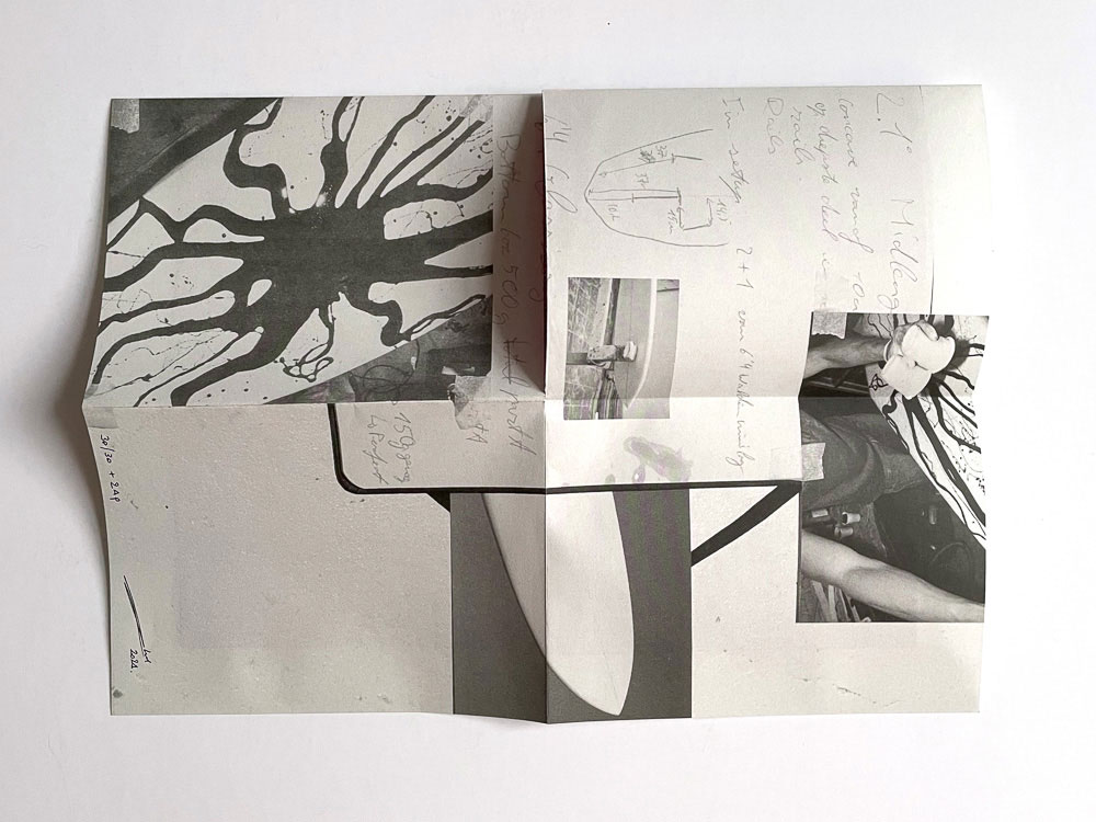
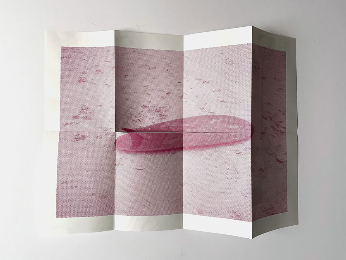
Creations 1
- Abel Kleinbatt
- Self-Published, 2021
Zines aren’t the only lower-budget alternative to commercially produced photobooks. Posters, postcards, miniature sculptures, intricately folded paper objects and other cleverly designed ephemera have also been changing hands over the past few years. Many of these arrive as unexpected free add-ons to purchased zines; others, like Abel Kleinblatt’s Creations 1, are intended as paper art objects in their own right. Creations 1 is an A3 poster. One side features roughly hand-written notes and photographs showing the design and building of a surfboard; one the other side, a photograph of the completed board with a graphic designed by Kleinblatt. The poster is folded down to a tiny size, inserted into its own silkscreened sleeve, and packaged in an envelope with a custom stamp. A smart and highly covetable object.
- Chosen by Eugenie Shinkle


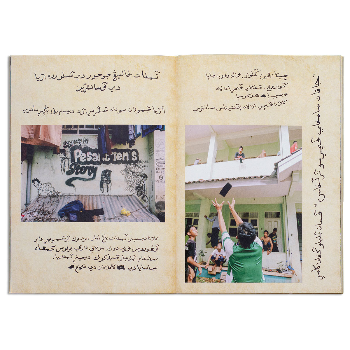
Tirakat
- Qolbee Maliki
- Published by SOKONG!, 2021
In Tirakat (rites of seeking God’s blessings), Qolbee depicts life inside a pesantren, an Islamic boarding school. The artist revisited the pesantren where he used to live in Pati, Central Java, Indonesia, and reflected on the spaces, interactions, activities, and knowledge that have come to shape his character today. By combining snapshots of tender moments with handwritten notes in pegon (Bahasa Indonesia written in Arabic alphabet) – a habit from his student days, he was able to make his personal experiences come alive.
- Chosen by Kurnia Yaumil Fajar, co-founding member of SOKONG!


Lockdown Blues
- Billy Kenrick
- Self-published, 2021
A lot of black ink has been spilled these past few years; sheet after sheet of black paper devoted to the presentation of grainy, disintegrated imagery; pages lush with misty abstractions… all in the service of an aesthetic that may or may not be linked to a growing need to find beauty in the bleakness of the present. Kenrick’s zine leans into the romanticism of the crepuscular – the half-glimpsed outlines of leafless trees, crumbling buildings, the lowering skies of winter afternoons, and the sprocket holes of his 35mm film. Made in his hometown in rural Ireland in the first eerie weeks of lockdown, there’s more than a touch of Wuthering Heights in this work.
- Chosen by Eugenie Shinkle


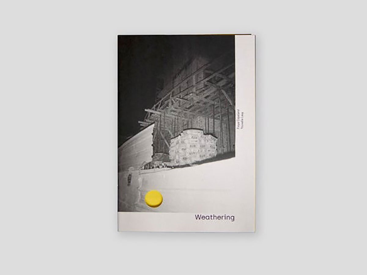
Weathering
- Freya Copeland & Youvalle Levy
- Published by Replika Publishing, 2020
One of the uniquely mysterious aspects of photography is what the individual eye is drawn to. We often see what is unseen to others. In Weathering, Copeland and Levy present a dualistic interpretation of the urban environment through subjects that more often than not remain unseen and forgotten, traversed over and around, mindlessly and inconsequentially. The two photographers combine their images in a back and forth sequence that plays out like a film shot in one long, continuous take. The viewer can imagine seeing all of these scenes during a single night walking through the streets of any nameless city. Piles of trash, bricks, windows, fences, barriers, traffic cones. The objects repeat themselves in the edit and create a disturbing sense of déjà vu. Once it is over, we are left wanting to start again from the beginning, reliving the same monotonous, monochromatic dream.
- Chosen by Andy Pham


Tied to Light Vol 1
- Tied to Light Collective
- Self-published, 2021
This beautifully designed object was released late in 2021 by London-based Tied to Light Collective. It features the work of eighteen artists, all of them working with experimental processes that push the boundaries of conventional photographic technique. Borrowing from the ‘exhibition in a box’ format that turned up a number of times during the pandemic, this zine takes itself a bit less seriously, encouraging viewers to experience the simple pleasures of unfolding, discovering, and recombining. Like Black Box Projects’ zine-format gallery brochure for Photo London 2021, works like these use the zine as a supplement to the gallery space – a take-home that has its own value beyond the work on the walls.
- Chosen by Eugenie Shinkle


