The ugly photograph: Form vs Content.
A couple dances and a woman laughs. That’s what a quick glance at Winogrand’s photograph below conveys. But linger a while longer, and the smiling woman transforms. She laughs hysterically, braying. Her ravenous grin opens to a void. Her fingernails, claw-like, grasp her partner. The ebullience of a shared dance takes on a bizarre violence framed by darkness.
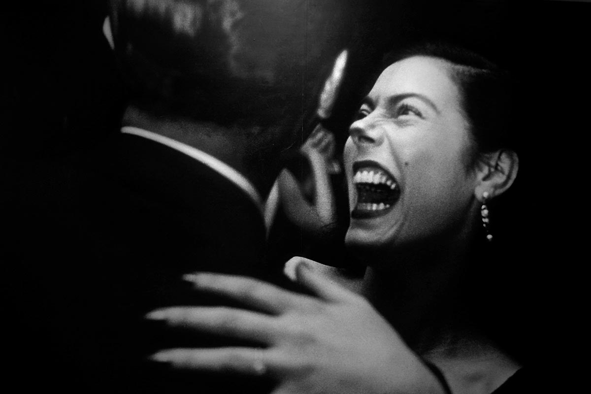
Garry Winogrand, an American street photographer (who hated the term street photographer and simply saw himself as just a photographer), claimed that “every photograph is a battle of form versus content.” Form is the photograph’s structure – its framing, layers, contours, and the way that it plays with light. Form comprises the visual elements that when combined make the image whole. Content refers to the meaning from the picture’s subjects or objects.
Intentionally bad form, or ugliness, raises this battle’s stakes. The tension created between form and content in the ugly photograph cracks open norms regarding visual reality, challenging the quotidian and the status quo.
In an age of omnipresent ‘nice’ images on Instagram, Facebook, and advertisements of all kinds, we are oversaturated by beautiful photographs. Yet, the postmodern world has become increasingly disordered, messy, and opaque. Enter the ugly photograph. Below, I explore the power of the ugly photograph to explore, to compel, and to transform reality in a chaotic world.
Bad form says to break the rules.
WRONG. That bold word anchors Baldisseri’s iconic image. If this photograph is so wrong, what is right? Therein lies the tension that Baldisseri’s photograph forces us to confront. Old-school conventions may dictate that this composition is all ‘wrong’ – Baldessari placed a man in front of a palm tree dead center in the photograph, as if the tree sprung from the man’s head. But if that’s so wrong, Baldesseri doesn’t want to be right. Wrong challenges us to transcend the notion of a right or wrong way to make art. Rather, every piece has its own merit depending on the photographer’s intention. Unshackled from right and wrong, the photographer moves from recorder to creater, and the viewer breaks free of judging photographs based on rigid, antiquated rules.
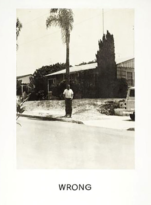
Bad form visualizes the nonvisual.
Photography, like painting, speaks a visual language. Yet the photograph, owing to the camera’s ability to harness light, seemingly captures “reality” with a higher fidelity than painting. Historically, capturing “reality” through photography required adherence to strict rules of how composition, lighting, the use of color, and aesthetics recreated a visual image.
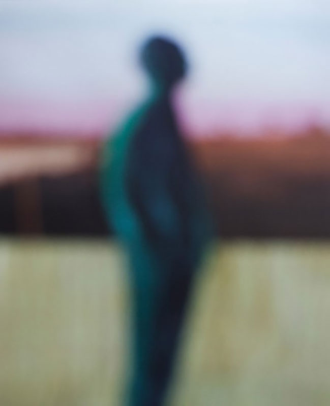
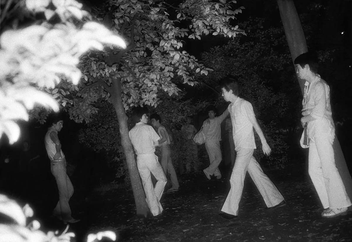
Yet what if that reality is inherently nonvisual? Or if the reality is so perverse that it remains hidden from the public eye? In the works of Armstrong and Yoshiyuki, bad form creates new visual realities. Both photographs above have traditionally bad technical form – they are out of focus, poorly lit, and aslant. While neither photograph is within the context of its series, both use bad form and ugliness to take on the nonvisual themes blindness and voyeurism. Through bad form, Armstrong and Yoshiyuki consciously create the otherworldly and typically nonvisual into images. Ugliness, a deviation from traditional photography’s realism, makes visualizing the nonvisual possible.
Bad form makes us raw.
Winogrand, speaking to the transience of capturing a moving photographic image, wrote that “great photography is always on the edge of failure.” The works of Richard Billingham and Sohrab Hura reveal how by exploring that edge through the ugly photograph, photographers can cast traditional norms in new light.
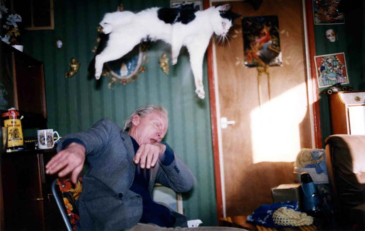
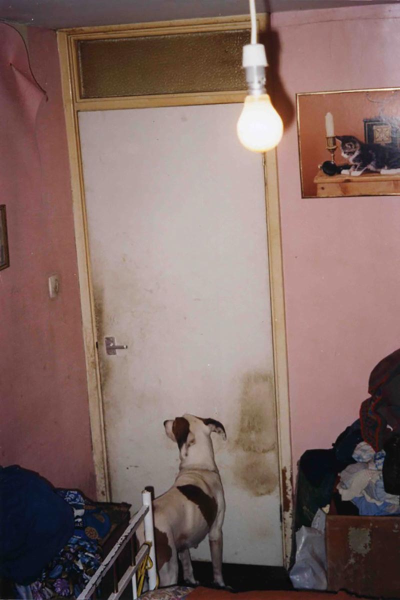
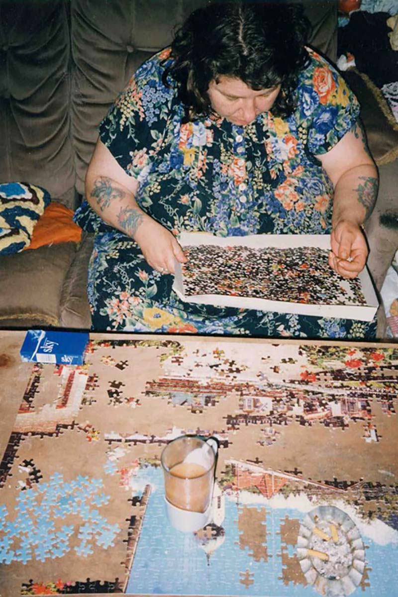
Billingham and Hura’s photo series have cheap looks – grainy, blurry, sometimes too bright, sometimes too dark. Much is intentionally wrong, blaringly so like Baldessari’s Wrong. Bad form pushes these photographs to Winogrand’s edge. Billingham’s Ray’s A Laugh uses intentional bad form to depict a lower-class British family with levity, joy, and humanity. Hura’s The Coast, a series exploring youth in contemporary India, imbues mystery, wonder, and violence into portraits of adventure and young love.
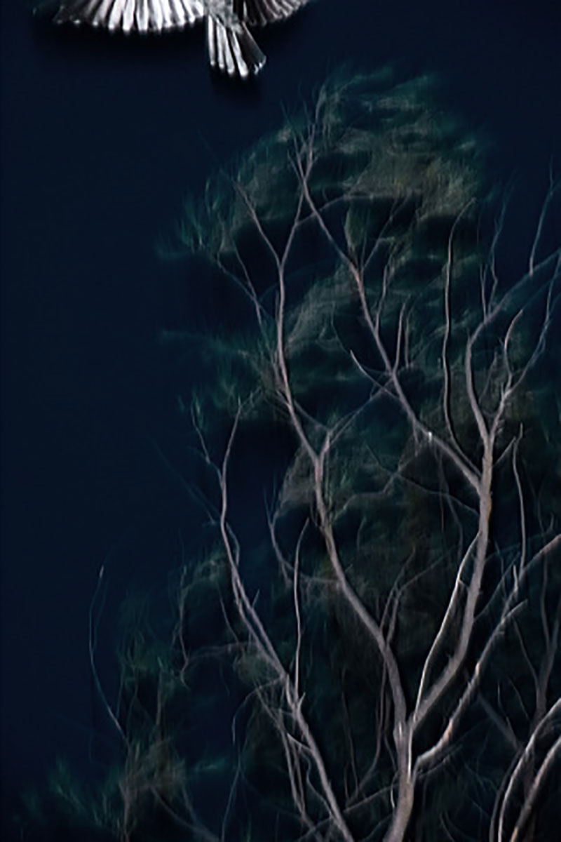
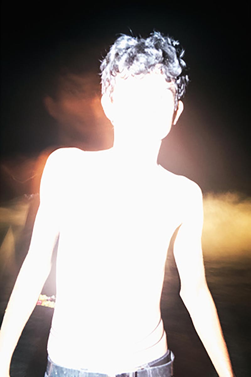
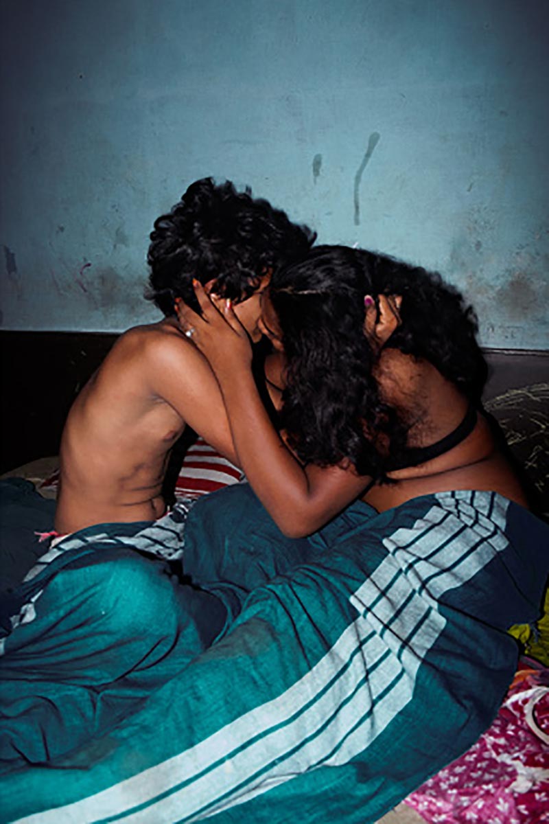
Bad form fractures traditional notions of love and family in our postmodern world. Rather than romanticizes and beautifying these ideals, Billingham and Hura aim for a more honest depiction of lived reality.
Bad form creates new meaning.
The ugly photograph need not overwhelm or visually disturb to create new meanings. Rudensky, Uibopuu, and Sassen employ another aesthetic approach – the uncanny. The uncanny photographs often contain strange, mysterious and unsettling atmospheres, like “the calm before the storm” feel. They possess bad forms that are subtly poetic in details, colors and lighting.
For example, Rudensky’s pair of images use abandoned places to depict voids, whose centers are anchored with red color (the red curtains and a splash of watermelon). These red moments provide a reference point around which the viewers might infer the images’ meaning.
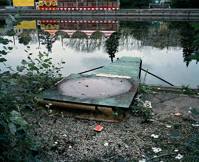
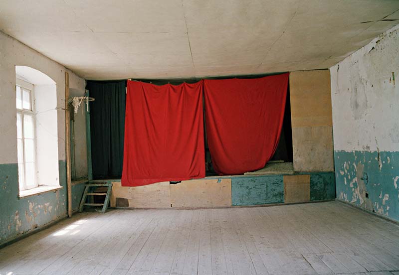
Uibopuu and Sassen use diffuse flash lighting to turn seemingly nondescript places into abstract forms that come alive visually. Their colors and details are highlighted and emphasized to the point that make them appear bizarre, as though they were no longer what they represented.
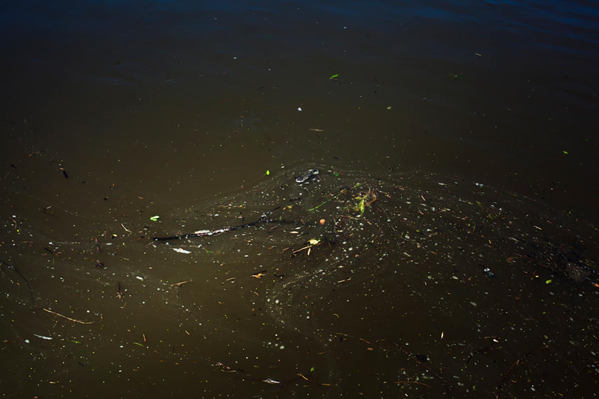
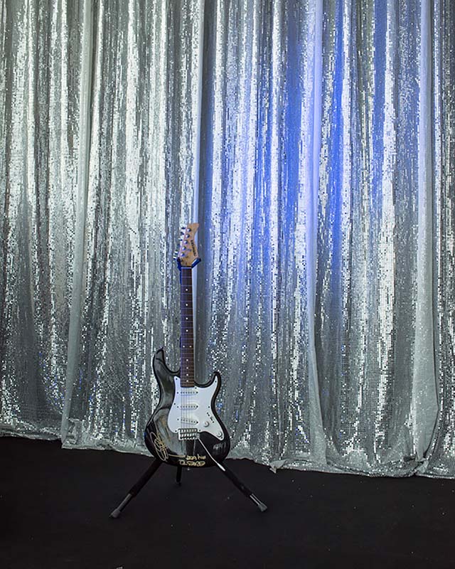
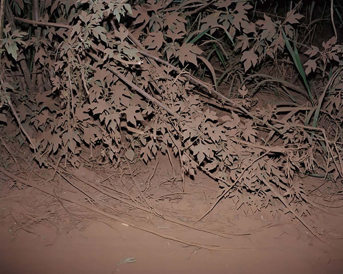
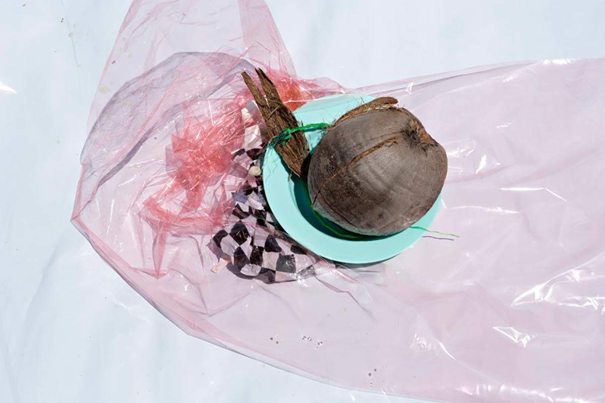
Upon closer examination, one can tell that these photographs’ bad forms are actually well-meditated. The form in each picture is intentional in order to create a sense of disquiet that makes us linger and question its meaning. Such is the uncanny quality that touches on our subconsciousness and inclination towards the unsettling aspects of our life.
A new reality.
To borrow from Tolstoy’s Anna Karenina, all beautiful photographs are alike; “each ugly photograph is ugly in its own way”. By creating a dissonance between form and content, the ugly photograph creates not records, makes us question rather than offers us answers. Perhaps this paradigm makes more sense in our disordered world. As the pretty photographs becomes more ubiquitous and thus more meaningless, perhaps we need more ugly photographs to help us make sense of it all.
*Article written by Dorothy Lutz & Dat Vu.
Dorothy Lutz is an American based in Da Nang, Vietnam working in foreign policy and can be reached at lutz.dorothy@gmail.com.
Dat Vu is a Vietnamese born photographer. He received his BA from Wesleyan University in 2015. Currently he is living and working in Cambodia, Laos and Vietnam for a year as a Mortimer Hays-Brandeis Traveling Fellow.
Follow him on Facebook and Instagram.
